Building This Portfolio With AI
You're looking at it right now. A solo product design and front-end build, from brief to deployed site, with Claude Code as a full-time pair-programmer, including the decisions it got wrong and the ones I overrode.
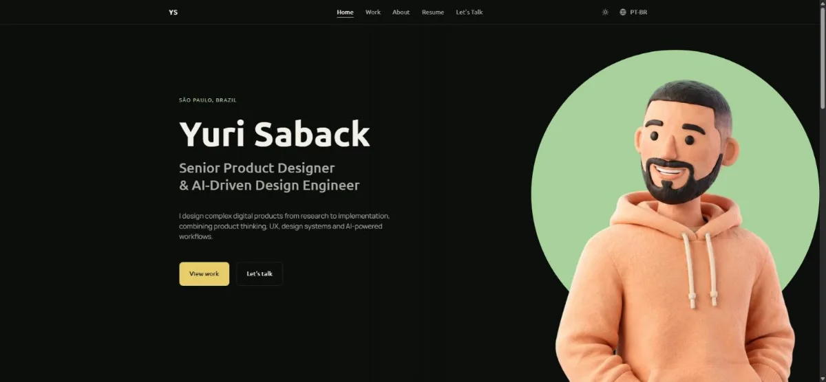
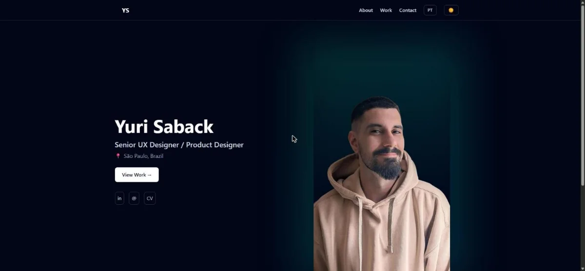
Drag to compare: the old portfolio (Figma Make) vs. this one. Same viewport, same theme, same language.
A site that had to prove the positioning, not just describe it
The old site described a "Senior UX Designer." This one had to read as evidence of a "Senior Product Designer & AI-Driven Design Engineer" actually working that way, for an audience of hiring managers evaluating senior, AI-era design roles. The brief came from a written PRD, built around one principle stated explicitly in it: "High signal, low cognitive load."
The goal (PRD §2)
Generate qualified conversations and interviews for international Senior Product Designer opportunities, not just look polished.
Non-goals (PRD §3)
No CMS, no contact form, no generic "AI-powered" buzzwording, no wall of tool logos, no competing with experimental design sites on visual effects. A dedicated "Handoff & Collaboration" section was cut later on purpose, that's a conversation for interviews, not portfolio copy.
"I'm great at collaboration." → "I worked closely with engineers to evaluate feasibility, define component behavior and prepare implementation-ready specifications."PRD §31 — Evidence Over Claims
The PRD specified its own development workflow
Section 33 of the PRD, "Portfolio Development Workflow," didn't just plan the site, it planned how the site would be built: the same loop Yuri uses on real products, applied to itself. Every step below is that exact workflow, not a reconstruction after the fact.
Discover
Define goals, audience and constraints.
Define
PRD + information architecture + content model.
Design
Design system applied to low-fidelity wireframes, page by page.
Prototype
Interactions and responsive behavior defined before production code.
Handoff
Specs, states and edge cases written down, even with no one else to hand them off to.
Build
Static HTML, CSS and vanilla JavaScript, with Claude Code as pair-programmer; a framework migration stays a plan until the content stops moving (PRD §23 explicitly warns against adding infrastructure without a product reason).
QA
Visual, functional, responsive and accessibility checks on every page before it shipped.
Deploy
GitHub, Vercel, and the yurisaback.com domain.
Iterate
Feedback and small corrections folded back in, session after session, this case included.
The PRD's own section 15, "Portfolio as a Case Study," planned this exact page before it existed, including a mandate to document what went wrong: "This generates far more credibility than showing only the final result."PRD §15 — Portfolio as a Case Study
Where I said yes, and where I said no
The working pattern for anything new or ambiguous: Claude Code states what it understood and lists the decisions it's about to make, then waits. Small, unambiguous tweaks go straight through. Two moments show how that played out when a suggestion was good on paper and wrong in practice.
Suggested: speed up the Home hero's entrance animation to help the mobile Lighthouse score.
Shipped, tested live, then reverted the next day: it felt rushed, and the feel mattered more than the score.
Suggested: invert the Work page cards' colors against the page's own theme, for contrast.
Tried it, found it too strong, reverted, then picked a quieter sage-tinted background from four options presented side by side.
The parts that took more than one pass
- →A "curtain" scroll effect: the hero stays pinned while a later, higher-stacked section slides up to cover it, reused unmodified as this exact page's own hero/body mechanic.
- →A Material-3-style FAB menu replacing the desktop nav below 760px, with focus trapped while open and Escape/outside-tap to close.
- →A bilingual (EN/PT-BR) switch with a ~0.6s decode animation, no page reload, the choice saved locally.
- →An image pipeline converting every asset to WebP before it ships, plus long-lived cache headers found missing in a real PageSpeed audit.
Real bugs, kept instead of polished away
A few of the mistakes that shipped, got caught, and got fixed, with the actual root cause, not just the fix.
A footer that bled through the page
A shared "curtain" footer's negative margin collided with a .wrap class placed directly on <main>. Hit on two separate pages before it became a standing rule.
An "order" that did nothing
order:-1 has no effect outside a flex or grid container. Only caught by screenshotting the real mobile layout, not by reading the CSS.
A logo missing most of its strokes
Pasted 3 of a company logo's ~10 SVG paths, assuming the rest were duplicates. They were separate brush strokes; three of them rendered as an unreadable fragment.
A git commit blocked by a full disk
The project drive hit 0 bytes free mid-session, silently failing even git commit. Not an app bug, a real operational one.
Checked, not claimed
Accessibility and performance were treated as requirements on every component, not a final pass, because this project was always going to become a case about how it was built. This is a real PageSpeed Insights report of the live site, not a staged number.

-91%
hero image size after WebP (572KB → 53KB)
-680KB
total image weight cut from the Home in one pass
12.99:1
worst-case card contrast after fixing a failed 2.17:1 overlay
0
auto-playing animations without a reduced-motion fallback