Tess — AI Tech Copilot
An AI assistant that helps field engineers find, understand and verify technical information, built mobile-first.
Alex needs the right answer in the field, and the proof behind it
Alex, 34, is a field service engineer: installs, inspects and repairs medical equipment across hospitals and clinics, consulting information on the phone while standing at the equipment. Manuals, specs, error codes and troubleshooting guides live in different places, and finding the right one takes time the person doesn't have on site. This persona is a design hypothesis for the challenge, not a research finding.
"When I need to inspect, maintain or troubleshoot a medical device, I want to find the relevant technical information and understand the next steps, so I can work efficiently while following authorized procedures."Job to be done
Alex works across many sites, and the phone is the fastest tool at hand. The prototype was designed mobile-first; a desktop version exists too, but as a static preview, not the focus.
Find
One question, many documents. Searches manuals, specs and procedures from a single query.
Interpret
A structured answer: summary, warnings, steps, for this specific equipment.
Verify
Evidence one tap away. Shows the source, says what it could not substantiate, points to support.
Five risks designed against:
- →Unsupported or fabricated answers
- →Outdated documentation
- →Wrong equipment context
- →Overreliance on AI
- →Insufficient evidence
The assistant supports the professional. It never authorizes a procedure or replaces manufacturer instructions.Design boundary
Simplify: one equipment, one flow, evidence at every step
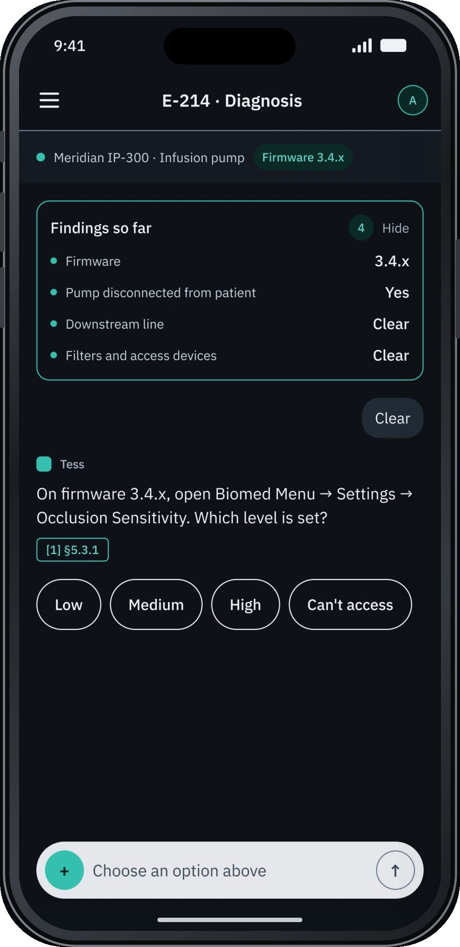
A guided diagnosis, not a data dump: a fictional Meridian IP-300 infusion pump, error E-214, with Tess asking short questions until the likely cause appears, so the user stays in control. Every turn has one active action and one scripted ending, so the demo cannot fail and every evaluator reaches the same complete story.
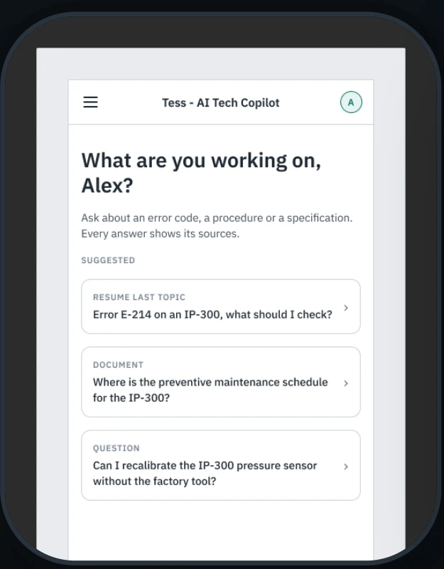
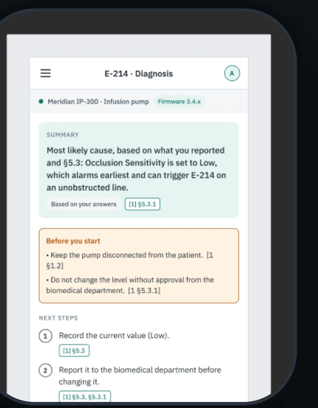
Eight decisions came out of that approach, each one a direct answer to one of the five risks above:
- →Tess asks for the firmware instead of assuming it. A wrong equipment context gives a wrong procedure.
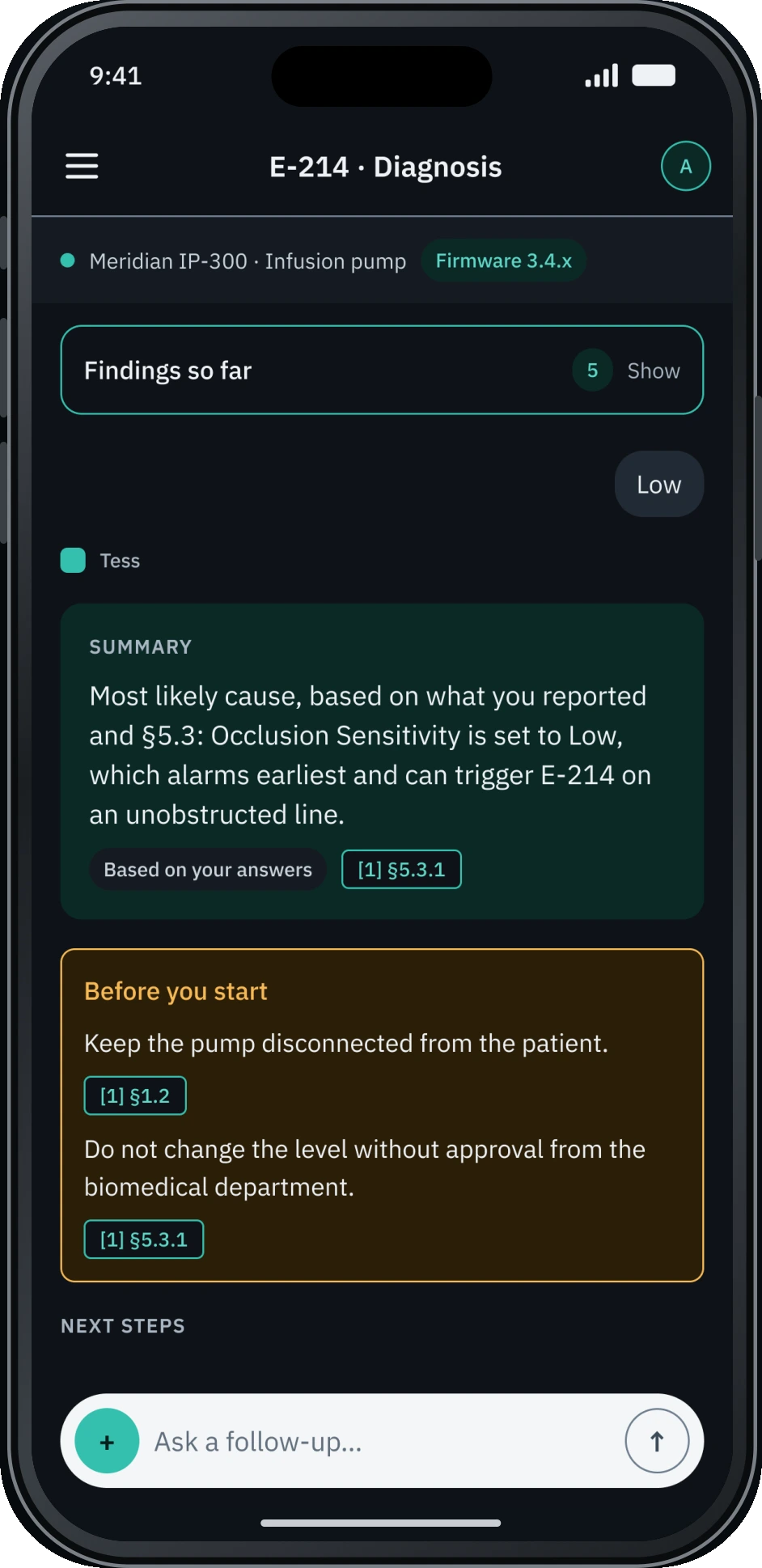
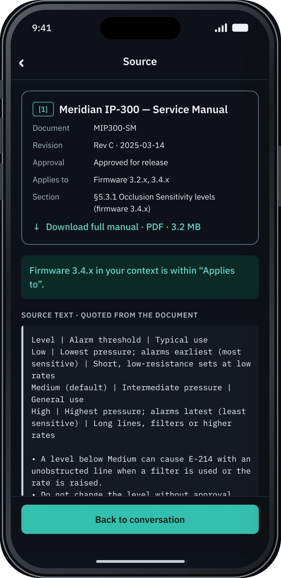
- →A citation on every step, inside the text. Verify without leaving the answer; no separate source list.
- →Warnings come before the steps. A warning below the steps gets missed.
- →Source text and AI explanation in separate blocks. Never blend a quote with a paraphrase.
- →"Ruled out" is labelled "not verified by the assistant." Show the limits of what was checked.
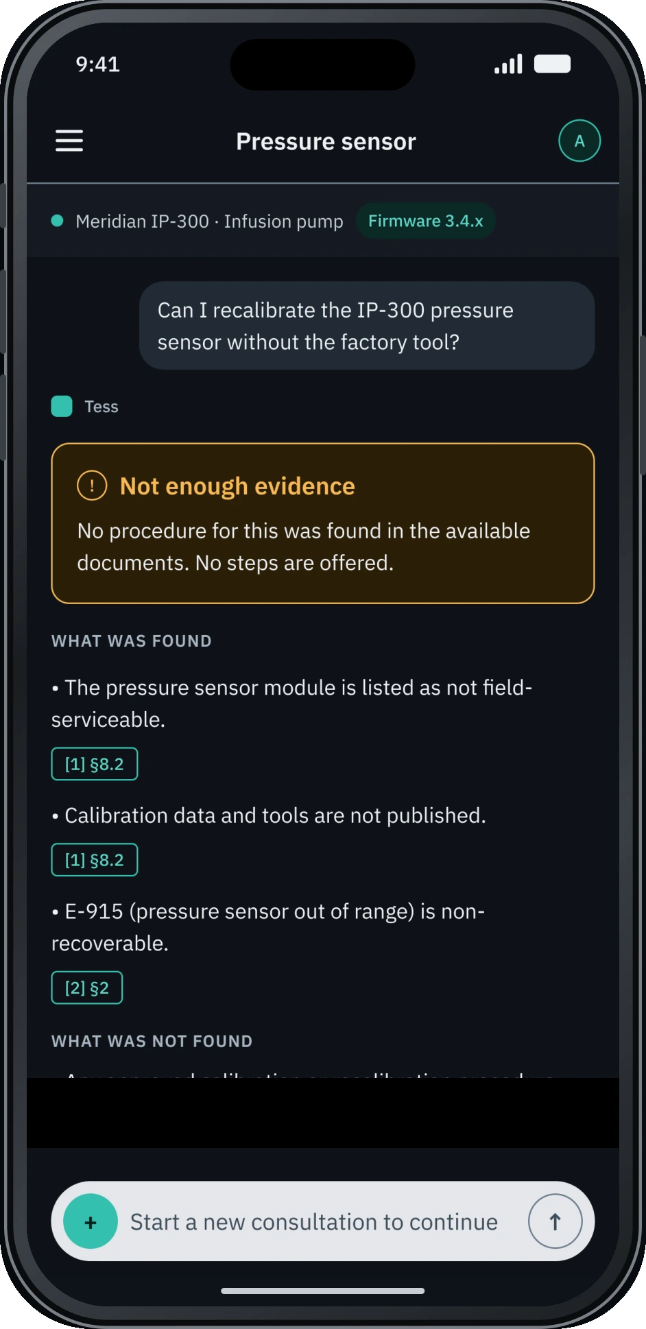
- →Insufficient evidence means no steps, escalation first. Never fill a gap with plausible steps.
- →Dark mode only, contrast checked. One theme fully verified beats two half-verified.
- →No hover, 44px primary targets. Touch first; a pressed state instead of hover.
One design system, two layouts
A proper foundation under a short timeline, verified rather than assumed:
4
variable collections, Light and Dark
10
text styles, IBM Plex Sans and Mono
35
components, reused on every screen
25
contrast pairs checked, WCAG 2.2 AA
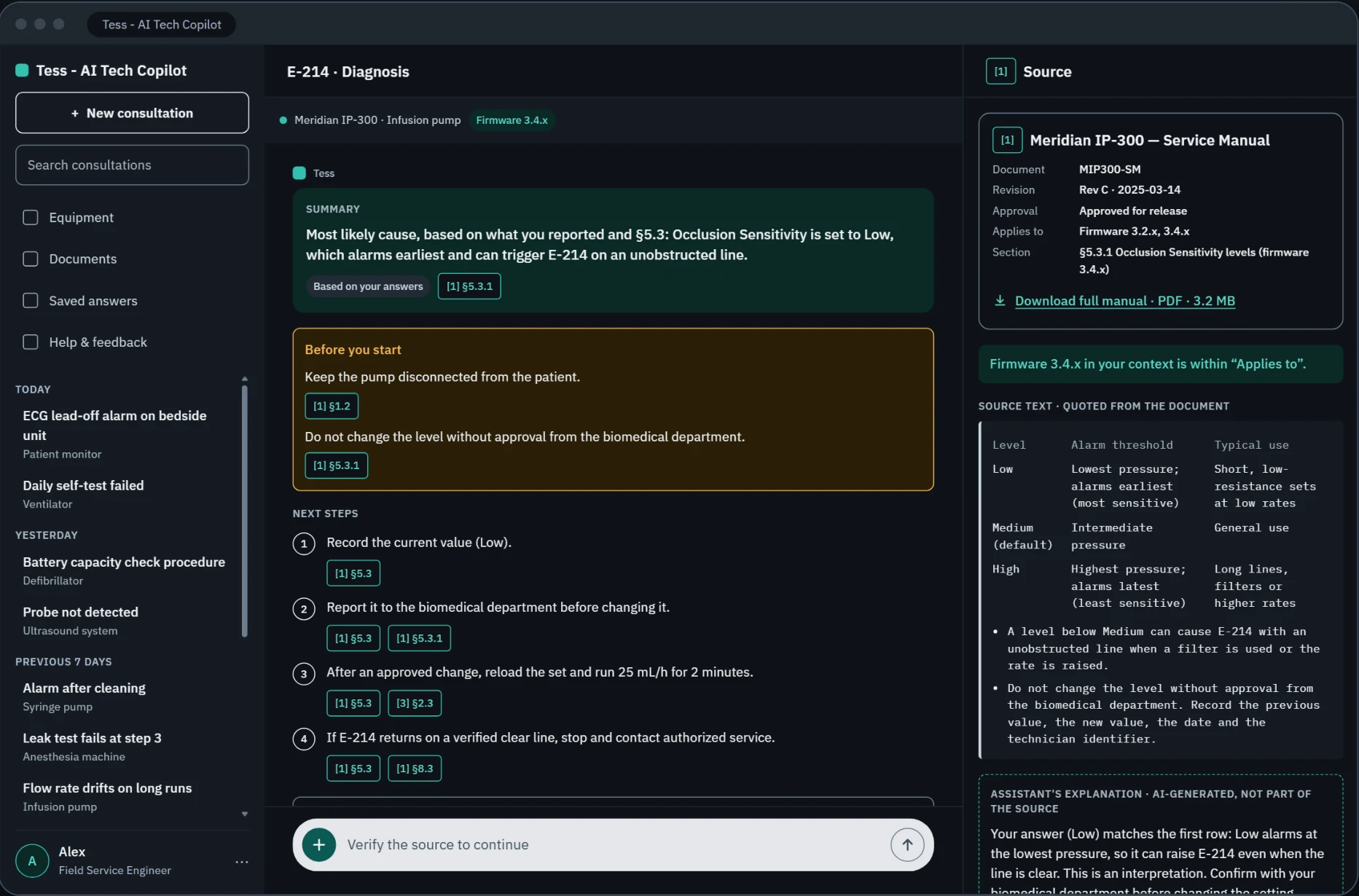
Why the desktop stayed a static preview: the challenge ran on a short timeline, and one fully polished mobile path beats two half-finished ones. Alex works across sites with a phone in hand, so mobile is where the interactive experience had to live.
Five screens,
from a blank question to a verified answer
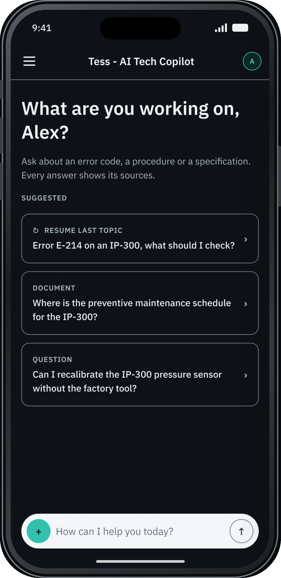
No equipment assumed at the start; a structured, citation-backed answer; a source the user can open and check; and an explicit "not enough evidence" state when the documents don't support a safe procedure.
Test the prototype
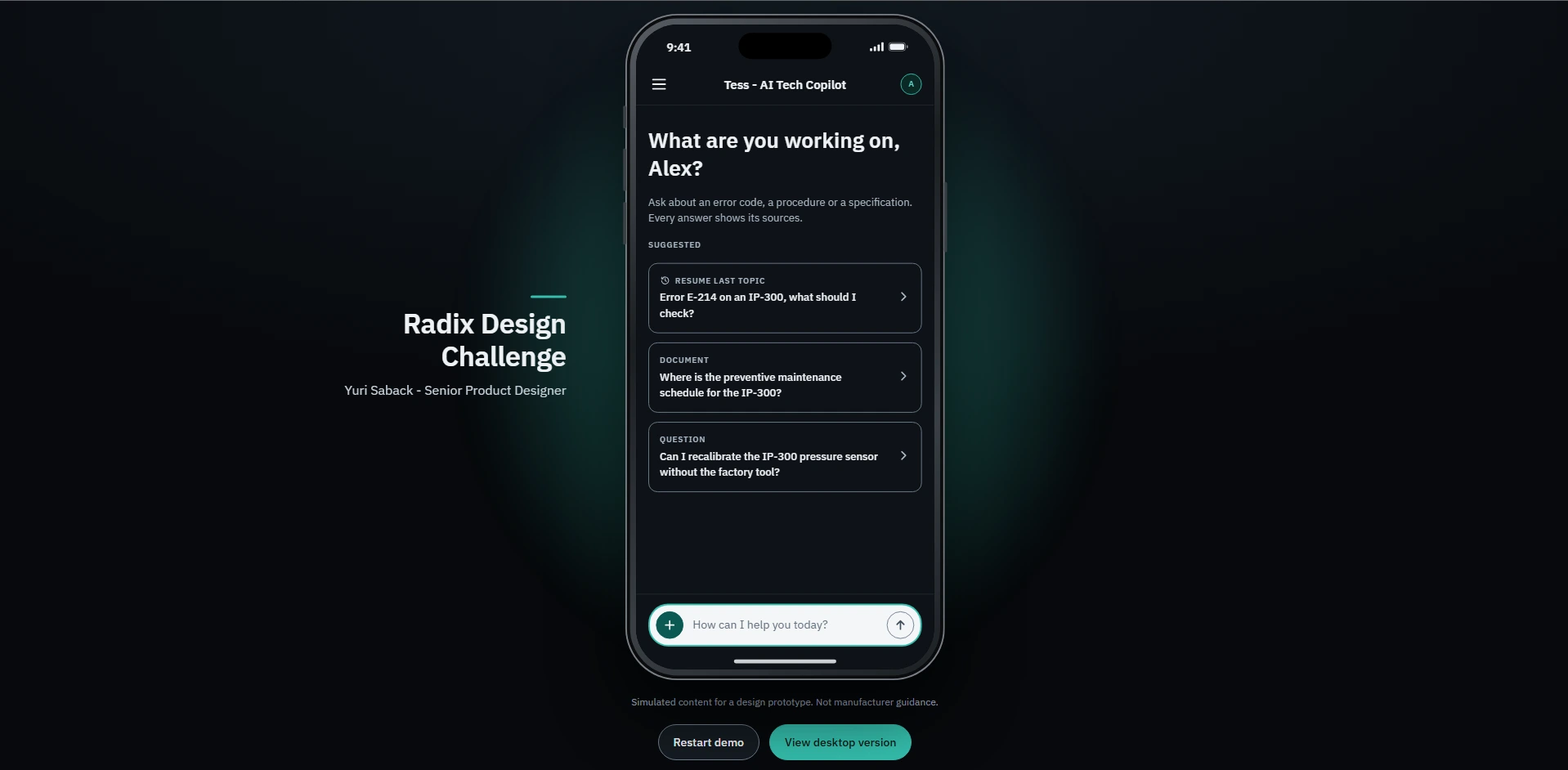 Try the live prototype
Directed by me, built with AI
Every phase ended with review and approval before the next one started: Definition, Wireframes, Design system, Prototype, Deploy, High fidelity, Handoff.
What I decided
- The scenario and the one scripted ending
- The visual direction and the mobile-first approach
- Behavior rules: citations, warnings first, no hover
- Every correction after reviewing the prototype
What AI executed
- The Figma file, through its MCP connection
- Prototype code, versioned and deployed
- Accessibility and contrast checks
- A review of the work against the PRD
11
states mapped in the handoff flow
11
specification panels: behavior, motion, accessibility
1
live link, updated on every push to main
What was delivered, and what is not proven
Delivered
5 final screens across 2 scenarios, a design system and developer handoff, an interactive mobile prototype live on Vercel, and a review against the PRD's success criteria, requirements, risks and guardrails.
Limits and conscious choices
No interviews or usability tests, so nothing is claimed about time saved or trust. Desktop stays a static preview. "Simulated content" is flagged outside the phone. All manuals and equipment are fictional.
Next: validate the PRD hypotheses, not claim results from them.
H1 — One entry point
Reduces the effort of finding information, compared to switching between manuals, specs and support.
H2 — A source beside each statement
Lets users verify before acting, instead of trusting an answer on faith.
H3 — A fixed answer structure
Is easier to scan on a phone than free-form text.
H4 — A clear "not enough evidence" state
Beats a confident, unsupported answer.