Retirement Check-up
Transforming a complex, confusing experience with over 70% abandonment into a clear 3-step journey, validated with real customers.
A complex journey that no one completed
The pension check-up journey existed, but it didn't work. It was long, loaded with unnecessary features, and unintuitive. More than 70% of users abandoned before finishing, because they didn't understand what it was for or how to proceed.
For the business
A high abandonment rate (over 70%) in a journey that's strategic for engagement and retention, with unclear feature usage and low conversion on plan adjustments.
For the client
A confusing, demotivating experience. Users didn't understand the journey's purpose or how to navigate it without friction, leading to early abandonment.
From diagnosis to a validated MVP
We didn't start with a ready solution. We began by analyzing where and why users gave up, mapping what was truly essential, and building a lean MVP to validate with real customers.
Behavior analysis
Analyzed user session recordings to identify critical abandonment points in the current journey, and why they happened.
Essential features mapping
Reviewed every step and feature, separating what was vital for users to complete the flow from what was noise or nice-to-have.
Minimum structure definition
Listed which data was really necessary and the logical step sequence to reach the goal without cognitive overload.
MVP creation
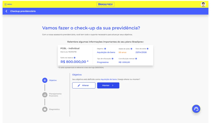
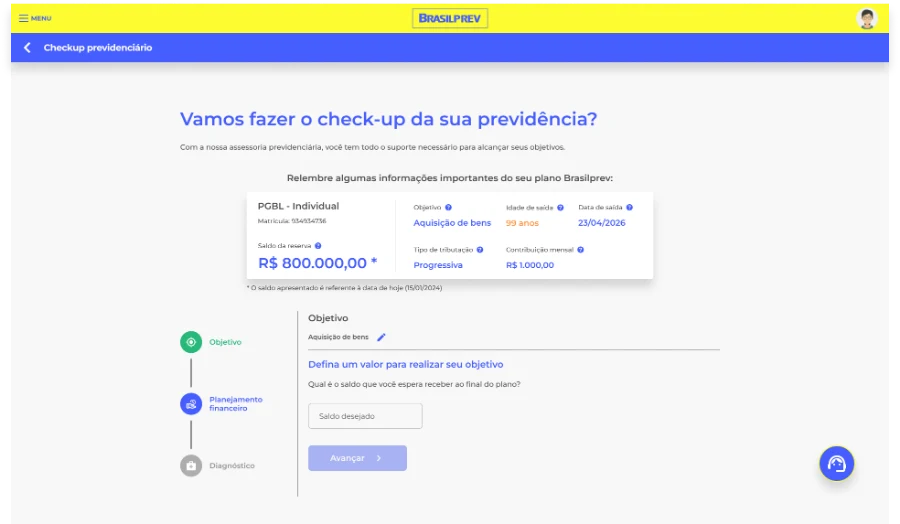
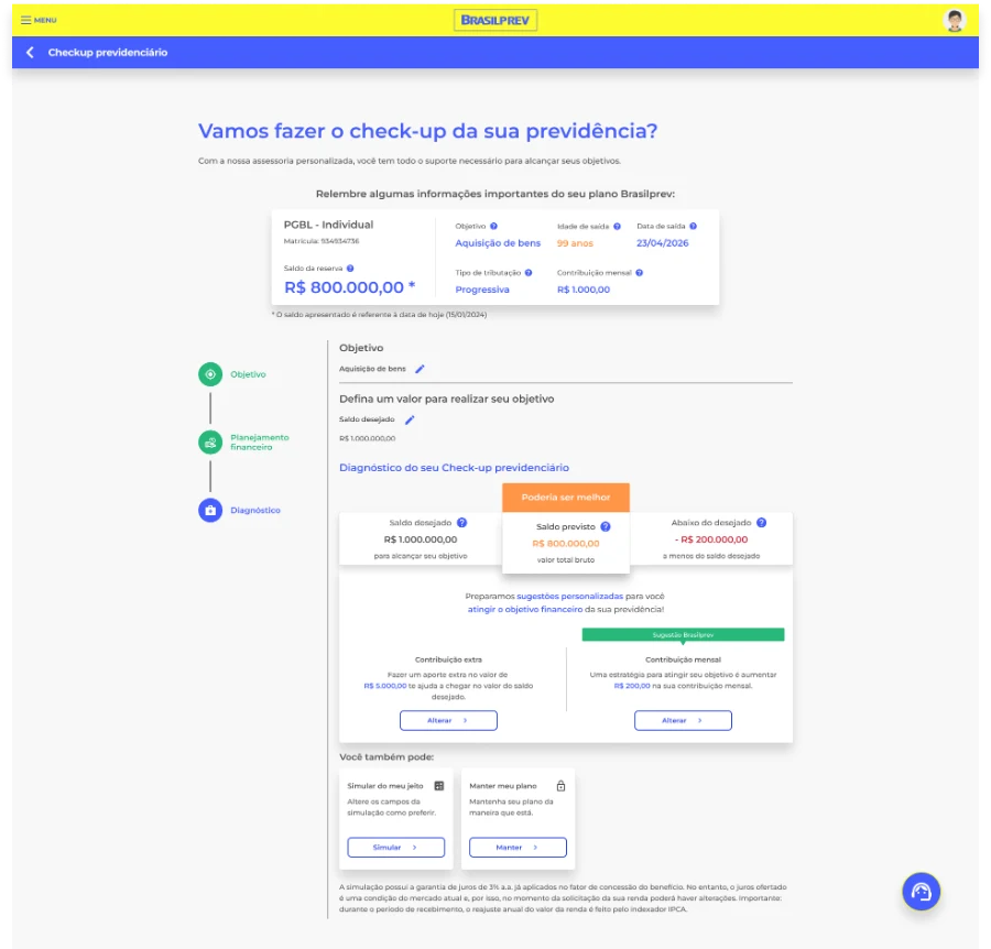
Designed a lean 3-step journey, Goal, Financial Planning, Diagnosis, focused on clarity and user autonomy.
Prototyping and usability testing
Built a high-fidelity prototype and tested it with real Brasilprev customers, validating hypotheses before development.
A 3-step journey with a clear purpose
An educational landing screen explains the check-up's purpose, followed by 3 intuitive steps that take the user from planning to a personalized diagnosis, with actionable suggestions right in the interface.
Results in the first 2 months
+66%
completion, up from a journey most people abandoned
↑ Conv.
more users completed the flow with a plan adjustment
3 steps
down from a long, confusing journey to an objective flow
What this project taught me
Less is more, if it's intentional
Cutting features isn't simplifying out of laziness. It's understanding what really matters for users to complete the journey and removing what's noise. The MVP validated this.
Session recordings are gold
Seeing where users got stuck, hesitated, or gave up was more valuable than any isolated metric. Observed behavior beats a declared opinion.
Onboarding isn't a luxury, it's a strategy
The educational landing screen was decisive in reducing early abandonment. Users need to understand the why before investing time in the how.
Validating with real users is non-negotiable
Usability tests confirmed our hypotheses, but also revealed friction we hadn't anticipated. Testing early prevents rework later.