Brasilprev Portal & App Redesign
Giving the logged-in area a strategic home and a mobile app built to stand on its own. It turned a portal with no clear entry point into the primary channel for digital service.
No home, no clarity, no engagement
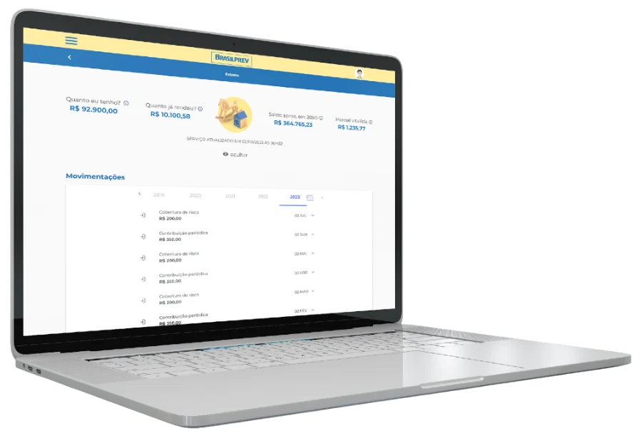
Customers logging in were sent straight to a bare statement screen, with no visibility into the other journeys the portal actually offered. Only 20% of service happened through digital channels; the rest fell back to phone support.
For the business
Strategic features stayed hidden, hurting conversion and keeping phone support costs high.
For the client
A confusing login moment. The statement worked as an accidental landing page, hiding features like extra contributions, profile updates and simulations.
Session recordings revealed the invisible
Hotjar and Clarity recordings surfaced navigation patterns, friction points and features people never noticed. Reviewing every existing journey against real usage data, not assumptions, set the priorities for what came next.
From diagnosis to complete redesign
Behavior analysis
Reviewed real user session recordings (Hotjar, Clarity) to find navigation patterns and friction points.
Essential features mapping
Reviewed every journey in the portal and app, prioritizing by usage data and qualitative research.
Strategic new home
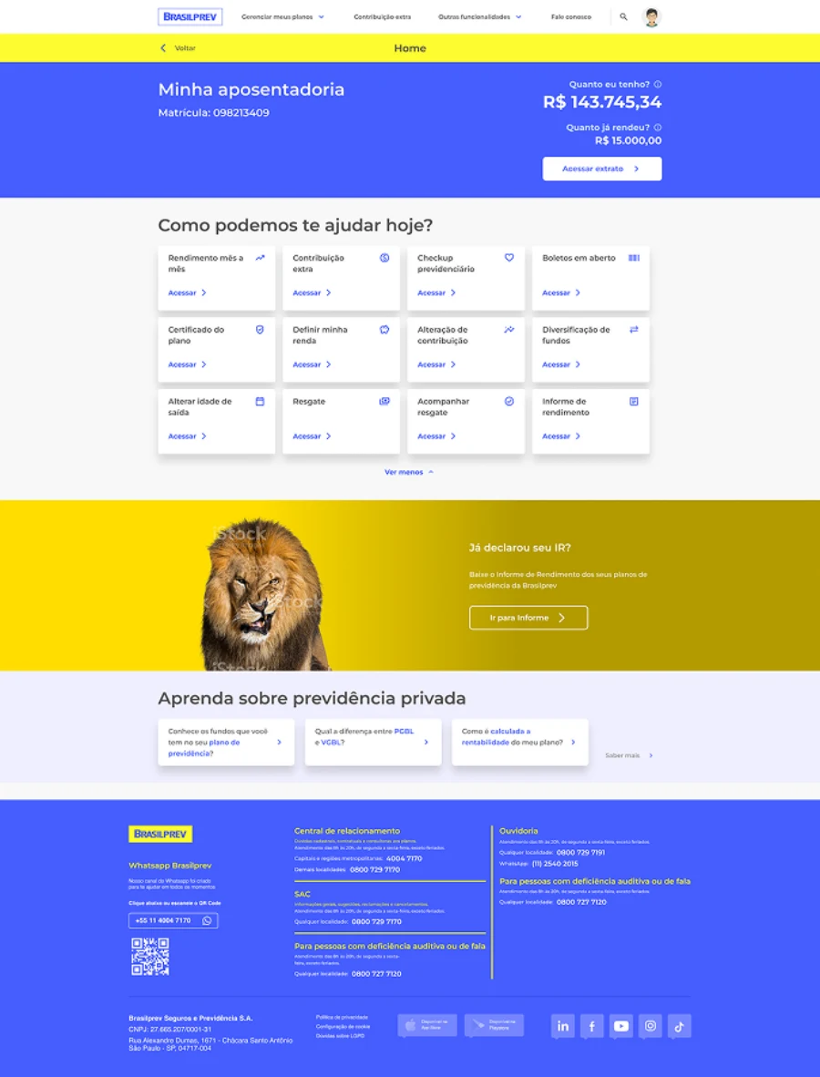
Designed a home to work as a central hub: statement summary, prioritized journey cards, an optimized menu and pension education content.
Mobile app redesign
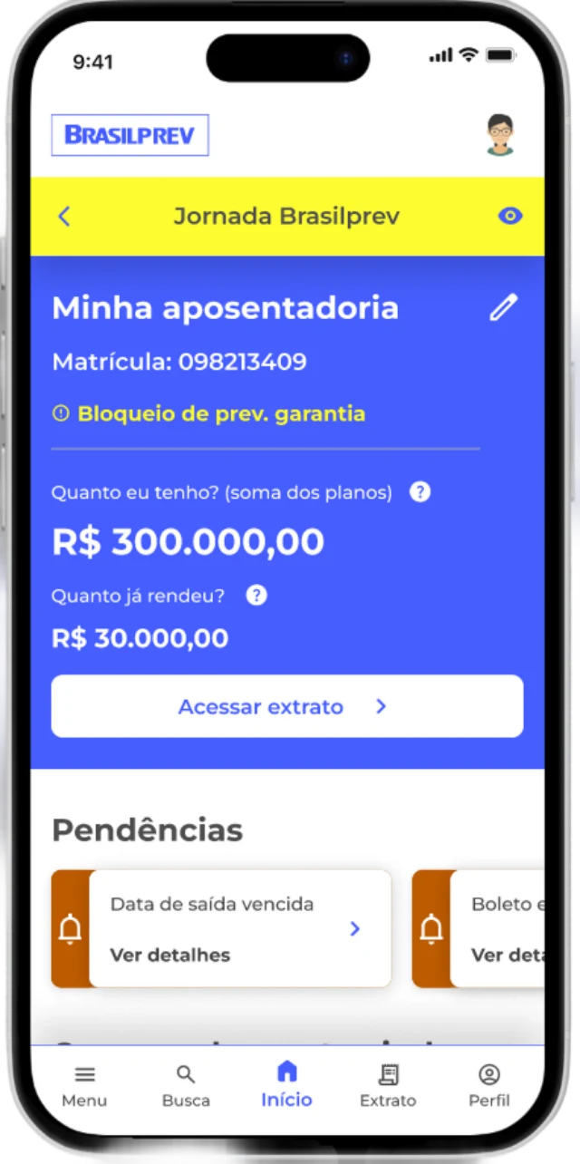
Replaced a site mirrored on mobile with an app carrying its own design system, menu, notifications and biometric login.
Self-service journeys
Built address-update and beneficiary-editing flows that previously required a phone call.
Usability testing
Validated every new journey with real customers, adjusting details before release.
The calls that mattered
"Just redesign the statement screen"
We built an entirely new home instead. The statement was never the problem; the missing entry point was.
"Ship the mobile app as a responsive wrapper"
We gave the app its own design system and native features, like biometric login, once data showed it needed to be a real product, not a mirror.
"Keep beneficiary edits on the phone line"
We moved it to self-service after mapping it as the single highest-cost recurring call type.
New home, new journeys, new app
A strategic home working as a navigation hub. Self-service journeys that cut operational cost. A native mobile app with its own design system and biometric login.
Tested before it shipped
Every new journey was validated with real customers, with targeted adjustments made before release to production.
Direct impact on engagement and cost
The redesign's results went beyond what we expected, with a direct impact on both the user experience and the business metrics.
82%
digital service (was 20% in 2020)
+66%
access to other services
+44%
extra contributions made
3.6
App Store rating (was 1.9)
4.9
Play Store rating (was 2.0)
+56%
total value contributed
+8%
average contribution ticket
The new home also generated savings by reducing dependence on phone support. Features that used to require a call, like changing beneficiaries or an address, are now done by the customer through the portal or app, at no cost to the operation.
What this project taught me
The home is the heart of the logged experience
Before, people fell into the statement with no context. Now they see everything they can do.
Session recordings reveal the invisible
Seeing where people clicked, hesitated or gave up was essential to prioritize what to build.
Digital self-service cuts costs exponentially
Simple journeys like address updates and beneficiary editing generated large operational savings.
A mobile app is not just a responsive site
A dedicated design system and native features raised both the experience and the store ratings.
Personalized dashboards increase autonomy
Showing the right financial information right on the home gave people confidence to act without calling support.